Sales
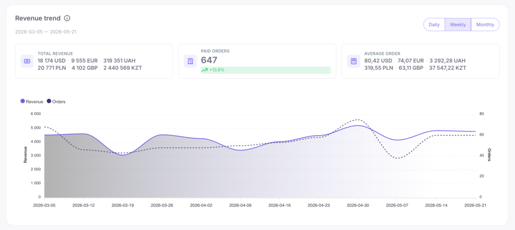
1. Revenue Trend
A chart of revenue and number of payments by days, weeks, or months.
- Total revenue. A multi-currency metric: amounts are displayed separately (e.g., 5,200 USD · 3,100 EUR · 480,000 UAH).
- Paid orders. The number of paid orders with a percentage comparison indicator (e.g., +13.6%).
- Average order. Also displayed separately for each currency.
How to use this data:
This is the main financial pulse of the school. If the average order value grows but the number of orders falls, the school is moving into a more premium segment and selling to fewer clients. If there are more orders but revenue doesn’t change, you are selling many cheap products, and you should consider implementing upsells.
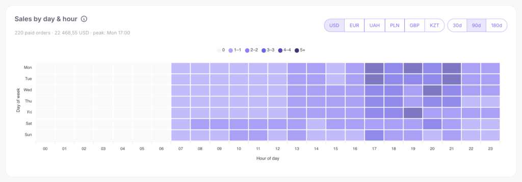
2. Sales by day & hour
A heatmap showing purchase times. Hovering over a cell displays statistics: Mon 19:00 — 12 orders · 850 USD.
How to use this data:
Sales prime time often differs from study time. Major sales are best launched during peak purchase hours, and emails should be sent in advance. Be sure to switch currencies: English-speaking (USD) and Ukrainian (UAH) audiences might have completely different peak activity times.
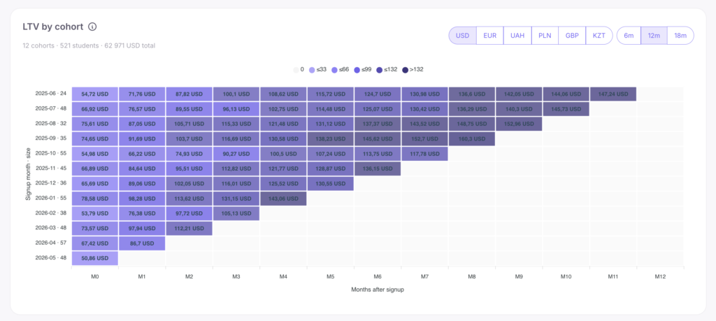
3. LTV by cohort
LTV (Lifetime Value) shows how much money, on average, one student brings in over all time. Rows represent the registration month, columns represent the number of months passed (M0, M1…). The cell displays the cumulative average revenue per client.
How to use this data:
The number in the cell always grows from left to right. If a client bought a course for 50 USD, and half a year later the total reached 80 USD — your upsells are working. If LTV doesn’t increase after the first month (M0), clients are making only one purchase. In this case, you should develop subscription clubs or advanced courses. Comparing by columns (top to bottom): if the December cohort’s metric was 180 USD in the 3rd month, and the April cohort’s was 240 USD, it means you’ve started working better with your existing customer base.
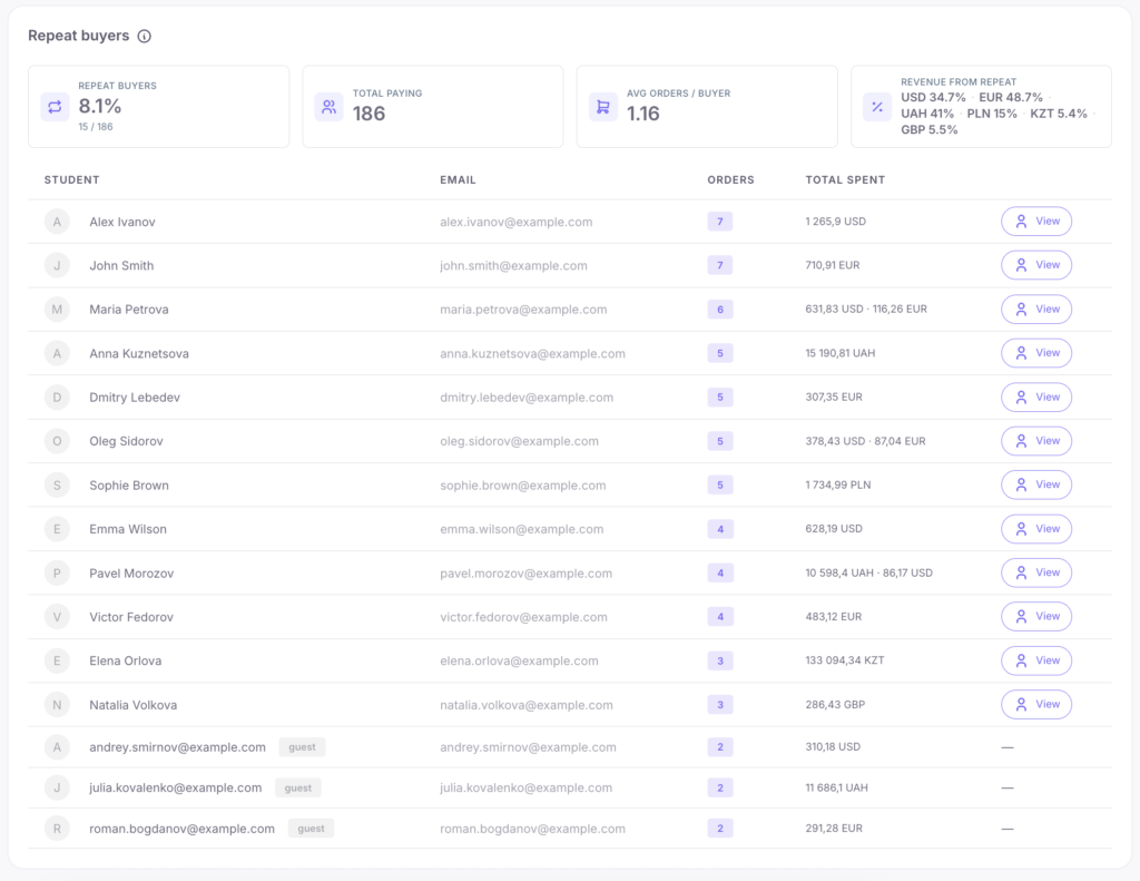
4. Repeat buyers
Loyalty statistics of your clients.
- Repeat buyers — the percentage of clients with 2 or more orders (purchases in different currencies are summed up as orders of a single person).
- Total paying — the total number of paying users.
- Average orders / buyer — the average number of purchases.
- Revenue from repeat — the share of revenue from repeat sales for each currency (e.g.: USD 58% · EUR 42% · UAH 31%).
Below is the Top-20 most loyal buyers list.
How to use this data:
A metric of 30%+ indicates excellent loyalty. Below 15% means the product line doesn’t motivate repeat purchases. Currency analysis will show which audience is more loyal (if repeat payments in USD are 58% and in UAH 31%, you should analyze the reasons). For clients from the Top-20 table, it is recommended to use personal sales and exclusive offers.
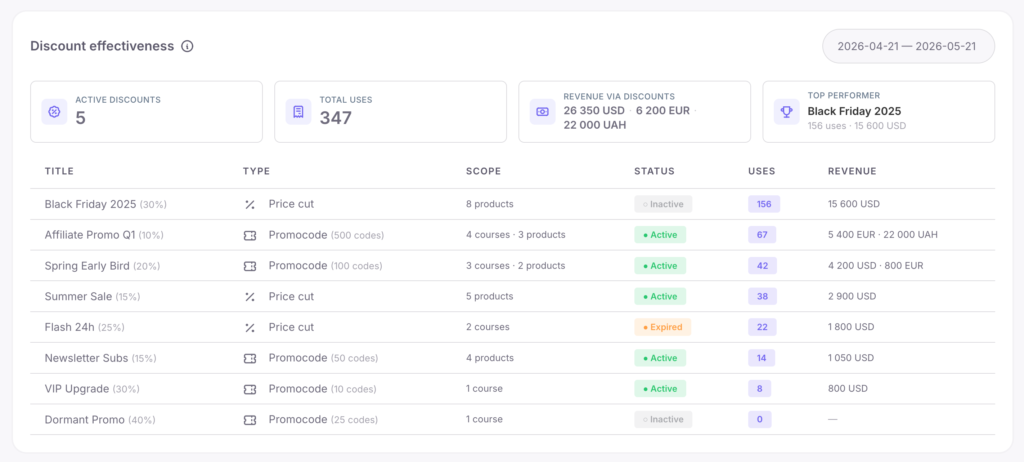
5. Discount effectiveness
A summary of active discounts, their number of uses, and generated revenue.
How to use this data:
A high number of uses with low revenue means the discount is just eating into your margin. Rare uses with high revenue mean the discount works well on premium checks — it should be promoted more actively. An active discount with 0 uses is better converted into a personalized promo code.
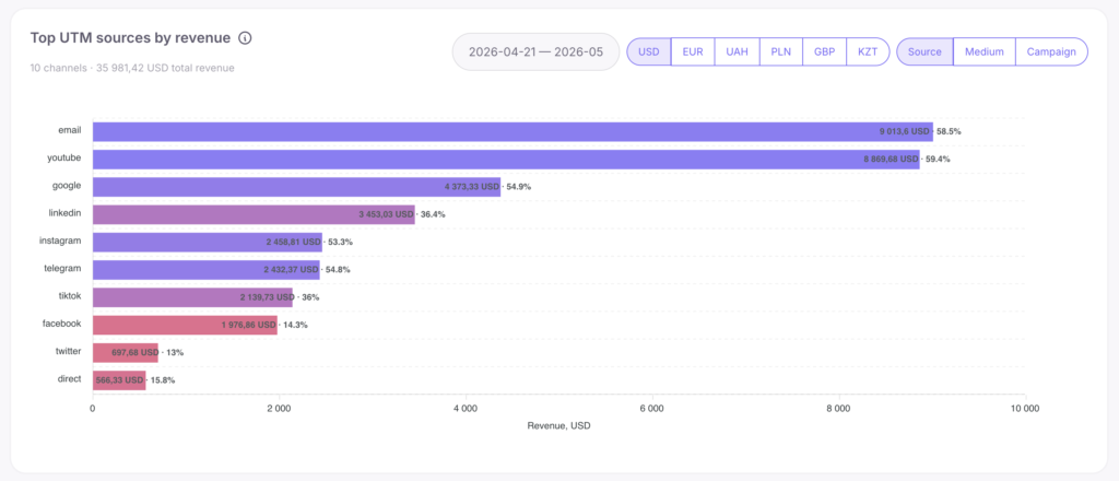
6. Top UTM sources by revenue
A horizontal chart showing the top 10 most profitable promotion channels. Toggles available:
- Source — platform (google, facebook).
- Medium — traffic type (cpc, email, social).
- Campaign — specific ad campaign.
The length of the bar shows the revenue volume, and the color intensity shows the conversion rate.
How to use this data:
When analyzing, be sure to switch currencies, as channels convert differently in different countries.
- Long dark bar (high revenue, high conversion) — an effective channel worth scaling.
- Long light bar (high revenue, low conversion) — requires landing page optimization since the traffic converts poorly.
- Short dark bar (low revenue, high conversion) — an excellent channel where you should add budget.
- Short light bar — an ineffective channel where costs should be cut.
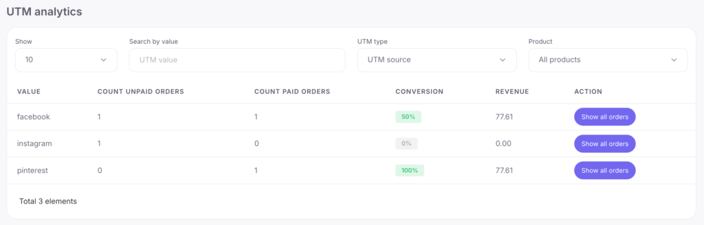
7. UTM analytics
An expanded table with statistics for all parameters (visits, registrations, orders). Clicking “Show all orders” opens the list of orders for a specific campaign. Handy for deep analysis and exporting reports.
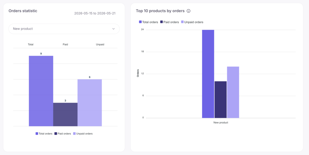
8. Order statistic / 9. Top 10 products by orders
The statistics widget shows the stages of a specific order (created, paid, unpaid). The top-10 widget generates a ranking of sales hits.
How to use this data:
Sales leaders require maximum focus and upsell configuration. Products not featured in the ranking should be repackaged or removed from the storefront so as not to distract buyers.