Education
1. Quick Cards at the Top
Four tiles showing an overall summary of the school for its entire history:
- Total courses — how many courses have been created on the platform.
- Total students — how many users are registered.
- Courses completed — how many times students have reached the end of their training. (If one student completes 3 courses, +3 is added to the metric).
- Received certificates — how many certificates have been issued.

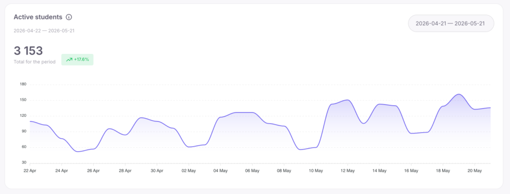
2. Active students
A chart and numeric indicator showing the number of unique students who logged into the platform each day of the selected period.
- The weekly scale shows 7 data points (one for each day).
- The monthly scale shows 30 data points (daily dynamics).
- The quarterly scale shows 90 data points (overall trend and seasonality).
The large number on the left is the total number of unique active students for the selected period. The colored indicator next to it shows a percentage comparison with the previous similar period.
Example: You selected the range “March 1-31”. The number 842 (+12%) is displayed. This means that 842 unique students logged in at least once in March, which is 12% more than in February.
How to use this data:
- Trend estimation: An upward chart indicates school growth and student activity.
- Period comparison: If the weekly number hardly differs from the monthly number, the same students are active. If the monthly number is significantly larger, you are regularly gaining new active users.
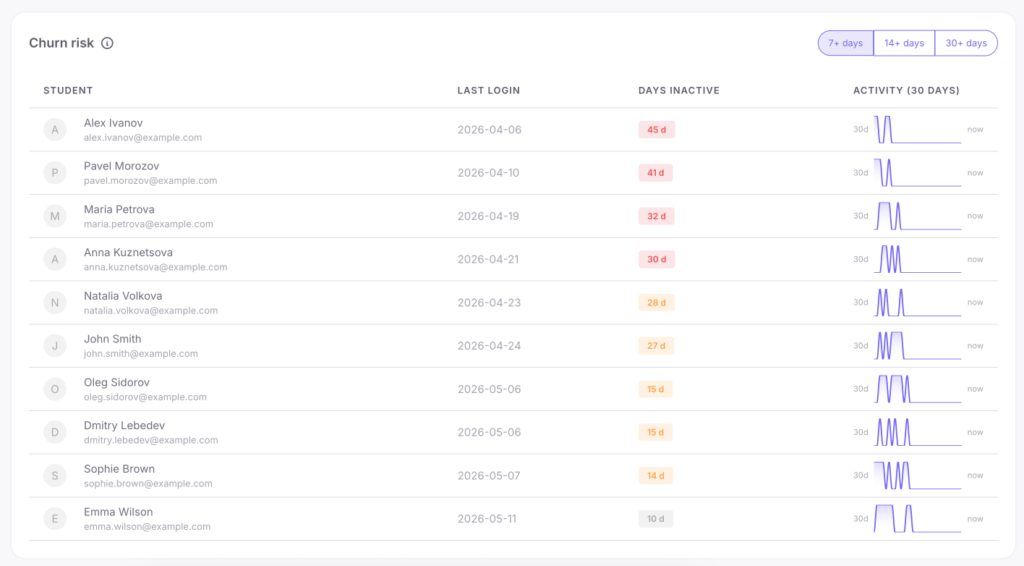
3. Churn risk
A table of students who haven’t logged into the platform for a long time. The toggle at the top filters the lists: 7+ days (absent for a week), 14+ days (two weeks), 30+ days (absent for a month or more). Displayed for each student: name, avatar, last login date, number of days absent, and a sparkline — a mini-chart of their activity over the last 30 days (shows whether the student lost interest gradually or disappeared suddenly).
How to use this data:
- Start with the “7+ days” tab — a week without logging in hasn’t become a habit yet, so these students are the easiest to bring back.
- Action scenario: Export the “14+ days” list every Monday and send them a personal email or call them (a typical return conversion rate is 15–25%).
- If the “30+ days” list is steadily growing, it’s a systemic problem (perhaps the course is too long or lacks motivation).
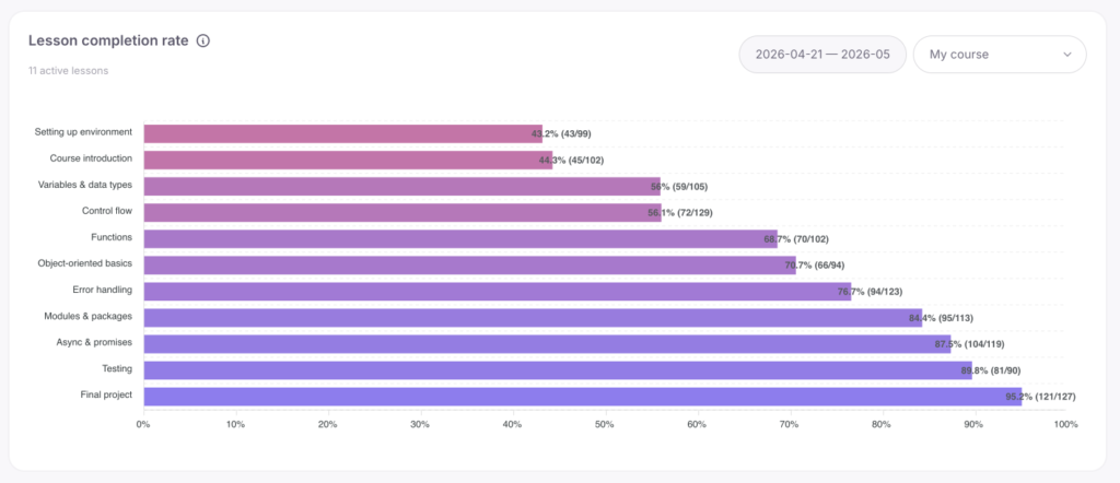
4. Lesson completion rate
A horizontal completion chart. You select a course, and each lesson is displayed as a bar. The length of the bar represents the percentage of students who fully completed the lesson out of those who started it. Lessons are automatically sorted — the most problematic ones are always at the top.
Example:
- “Introduction” lesson — 95% completed.
- “First Practice” lesson — 82% completed.
- “Working with API” lesson — 31% completed (this is the problematic lesson).
How to use this data:
The top 2-3 lessons on the list require immediate attention. Common reasons for low conversion:
- The lesson is too long (it’s better to split it in two).
- Complex theory delivery (the material should be rewritten).
- Practice without clear instructions. After making changes, check the metrics in 2 weeks — the percentage should increase.
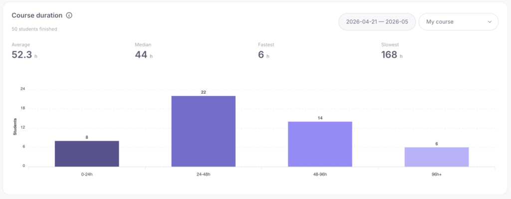
5. Course duration
The widget shows how much time students spend on the entire course:
- Average — average time in hours.
- Median — the metric of a “typical” student (half finish faster, half slower).
- Fastest / Slowest — time records. The histogram below divides students into groups: 0–24 h, 24–48 h, 48–96 h, and 96+ h.
The median is more informative than the average value because the average is often skewed by isolated cases. For example, if a few students take a very long time to complete a course, the average time will artificially increase. The median excludes such extremes and shows the real time it takes most students to finish the course.
Example: Average = 62 hours, median = 38 hours. This difference means there is a small group of users with a long learning duration, but the vast majority of students finish the course in 38 hours.
How to use this data:
- If the median greatly exceeds your expectations, the program is difficult for students; consider adding motivational emails.
- If the “96+ hours” group is large, these students are at risk of dropping out.
- A very low median for an extensive course is a suspicious sign: students are likely just scrolling through the lessons.
6. Course completion funnel
An inverted pyramid chart. Each layer is a separate lesson, and its width is the number of unique students who completed that lesson. The bottom layer shows those who fully completed the course. Tiles above the funnel:
- Reached step 1 — the number of people who started the course.
- Finished course — the number of people who reached the end.
- Overall completion — the percentage of finishers out of those who started.
Hovering over a bar reveals values, for example: Lesson: Working with API — 65 (-16.7%). This means 65 students completed the lesson, and the brackets show the drop-off percentage from the previous step. The value is always negative since the number of people cannot increase.
Example:
- Lesson 1: 85
- Lesson 2: 78 (-8.2%) — lost 8.2% of the students from Lesson 1.
- Lesson 3: 65 (-16.7%) — lost 16.7% of the students from Lesson 2.
- Lesson 4: 36 (-44.6%) — this is the narrowest point where nearly half of the students are lost.
- Lesson 5: 32 (-11.1%)
- Course completed: 28 (-12.5%)
How to use this data:
- The highest negative percentages will show exactly at which stage you are losing the most students.
- Evaluate the “Overall completion” tile: 40%+ is considered excellent; 15–30% is normal for long programs; below 15% means the course is losing too much audience.
- Important: The percentages on the bars represent step-by-step decline. A 10% drop-off at each of 5 steps will result in a total loss of 41%, not 50%.
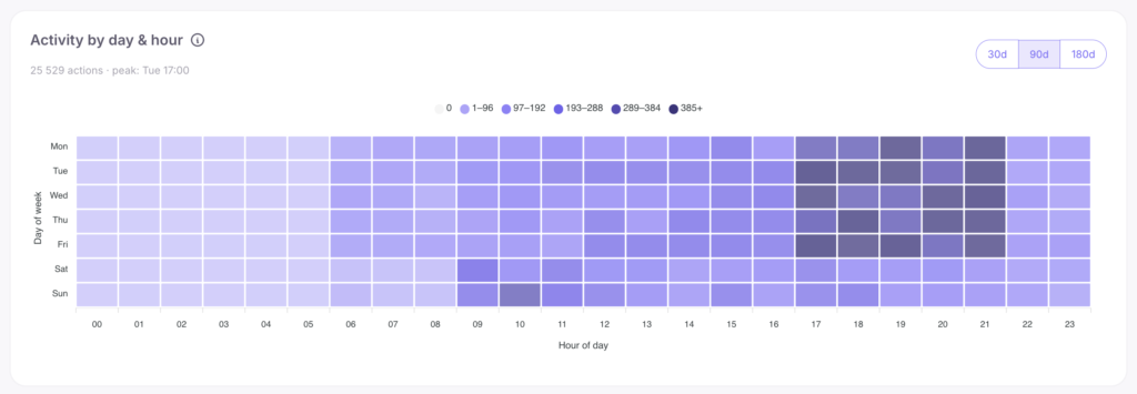
7. Activity by day & hour
Heatmap: hours (0-23) are on the horizontal axis, days of the week (Mon-Sun) on the vertical axis. The darker the cell, the more active students there were. A toggle for 30, 90, or 180 days is available.
How to use this data:
- Dark cells indicate your prime time. Mass emails should be sent 1–3 hours before this time.
- It’s better to schedule webinars during peak hours, and major course updates, module structure changes, or school settings adjustments — during the lightest cells (usually night or early morning when student activity is minimal).
Example: If activity peaks from Mon to Thu between 19:00 and 22:00, and weekends are empty, it means your students learn after work. Sending important news on Saturday will be ineffective.
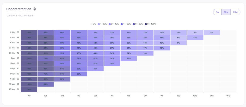
8. Cohort Retention
This advanced widget is a student retention table:
- Rows (Cohorts): groups of students registered in the same week (oldest at the top, newest at the bottom).
- Columns (Weeks): how many weeks have passed since the cohort’s registration (W0 = first week, W1 = second, etc.). The W0 column is always 100%.
The weeks in the table are relative. W3 for the December cohort is the end of December, while W3 for the March cohort is the end of March. This allows you to accurately compare the behavior of different groups at the same stage of learning. Gray empty cells in the lower right part of the table do not mean drop-offs. They show that this number of weeks simply hasn’t passed yet for new cohorts.
How to use this data:
- Reading a row (left to right): shows the gradual drop-off of a specific cohort (W0=100%, W1=65%, W2=48%, W3=40%).
- Comparing a column (top to bottom): helps estimate how retention changes over time. If 70% of students in the December group returned on week W2, 65% in January, 55% in February, and 45% in March — this is an alarming sign. New students are losing interest faster than usual.
- Action scenario: Check the W1 and W2 metrics of a few recent cohorts once a week. W1 (return on the second week) is the first indicator of problems. A sharp drop at W1 suggests onboarding failures, at W3-W4 — difficulties in the middle of the course, and a drop at W8+ is normal (students are finishing their studies).
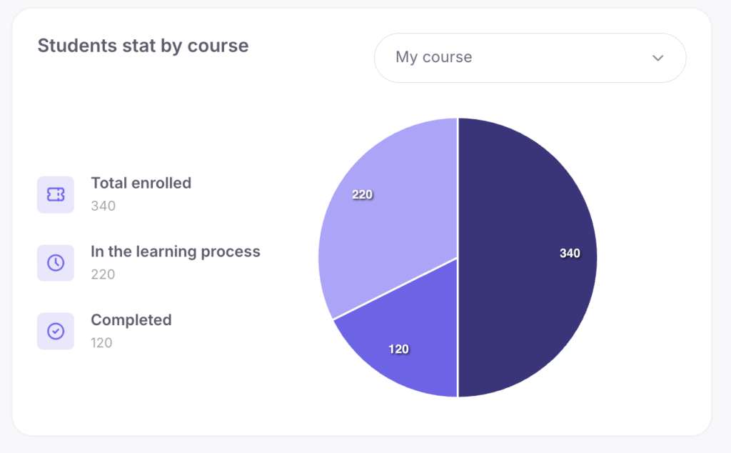
9. Students stat by course
A pie chart for the selected course with the metrics: Total enrolled (gained access), In the learning process, and Completed.
Example: Total enrolled: 120. In progress: 45. Completed: 30. This means 45 people are actually studying, 30 finished successfully, and 45 (120-45-30) abandoned their studies right at the start.
How to use this data: If the “Total enrolled” metric significantly exceeds the sum of those in progress and those who completed, you have an activation problem. Students get access but don’t open the first lesson.
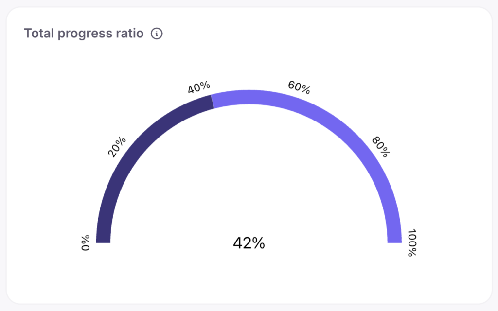
10. Total Progress Ratio
A chart showing the share of actual course completions out of all created enrollments across the entire school.
How to use this data:
This is a general indicator of learning success. A 40%+ rate is rare and indicates excellent engagement; 20-40% is the market norm; below 15% is a signal for a detailed funnel analysis.
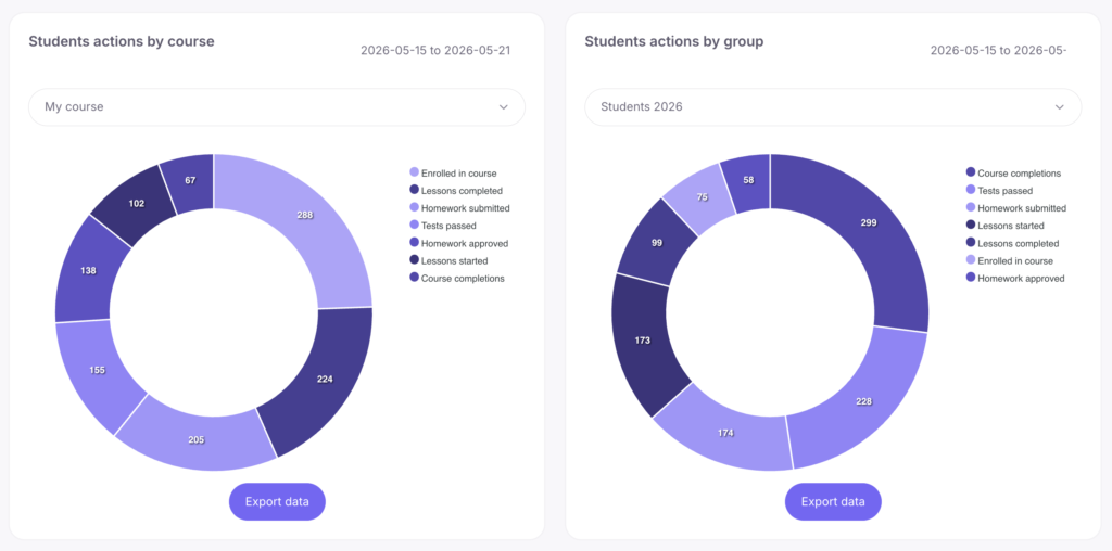
11. Students actions by course / 12. Student actions by group
Two widgets with action charts (lessons started/completed, homework submitted, tests). The first shows statistics for the entire course, the second — for a specific student group. The data can be exported to a CSV file.
How to use this data:
Handy for reporting and comparing different cohorts. For example, if the June group submitted far more homework than the September one, you should analyze the reasons (tutor influence, modified content delivery, or ad traffic).